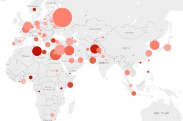
This very short article will contribute to the section „Analytics with R“ and how results can be visualized using Tableau. The following few maps depict those Twitter posts that match the keywords „refugee“, „asyl“ or „flüchtlinge“ and that include readable information about the origin (location) of the post.
After data was collected and preprocessed in R, we used a Tableau Trial-Version to visualize results in the best possible manner. Tableau is an easy-to-use Software for visualisation and comes with a 14-days free-to-use version after installation.
The color represents the average sentiment score of the posts originating from the location, the size of the bubbles shows the number of tweets per Location. Tweets have been collected between 06th and 8th of November 2015.
The upper map additionally illustrates, what kind of tweets are included in total analysis. For this one tweet per location was randomly chosen to be displayed on the map.

